JYN Skincare
Design, Illustration, Copywriting, UI Design
JYN Skincare is a conceptual Asian-beauty skincare brand that places emphasis on healing male skin.
Male skin biologically carries characteristics which differentiate it from female skin, such as being firmer with higher presence of Androgens, as well as structural differences, as seen in fat and connective tissues. However, male skin tends to go more unnoticed due to the lack of normalization of male skincare.
Along with catering to biological differences, JYN Skincare seeks to break stigma surrounding men and skincare, primarily on Asian skincare, as well as bringing more awareness and accessibility to naturally-derived, Asian skincare for men.


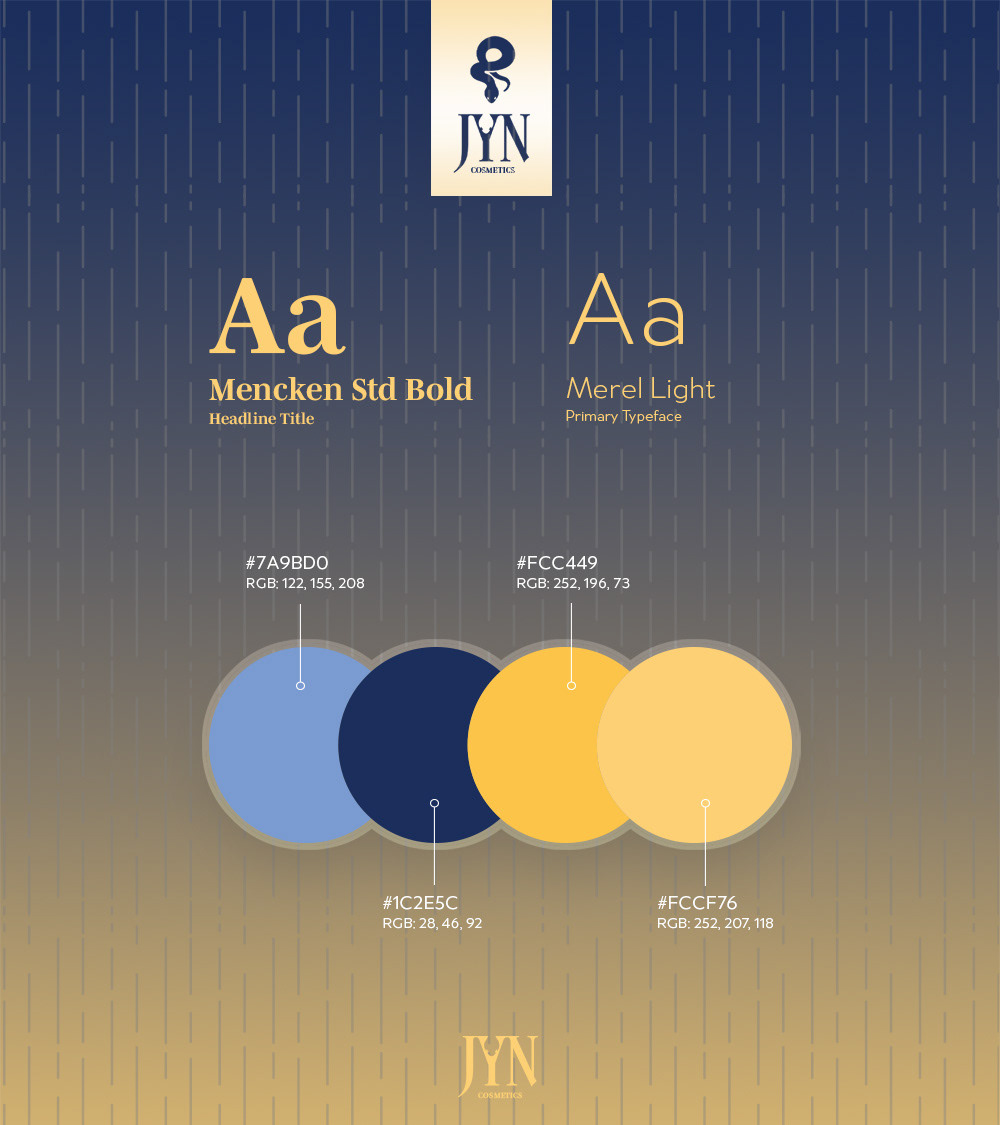
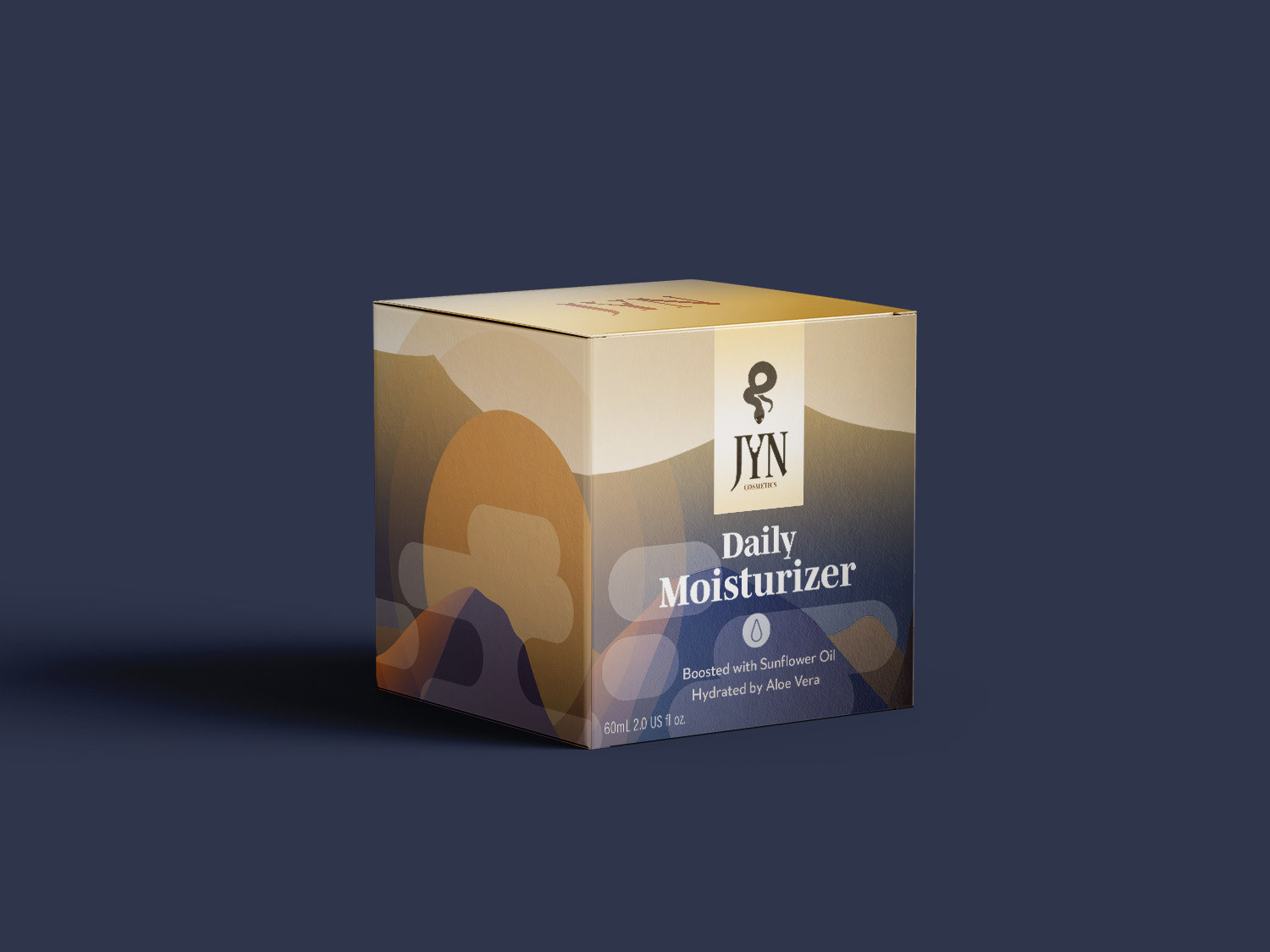
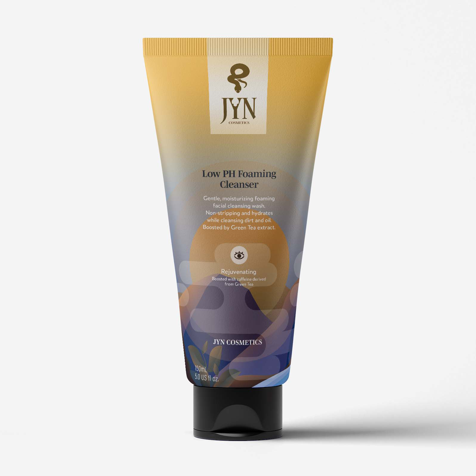
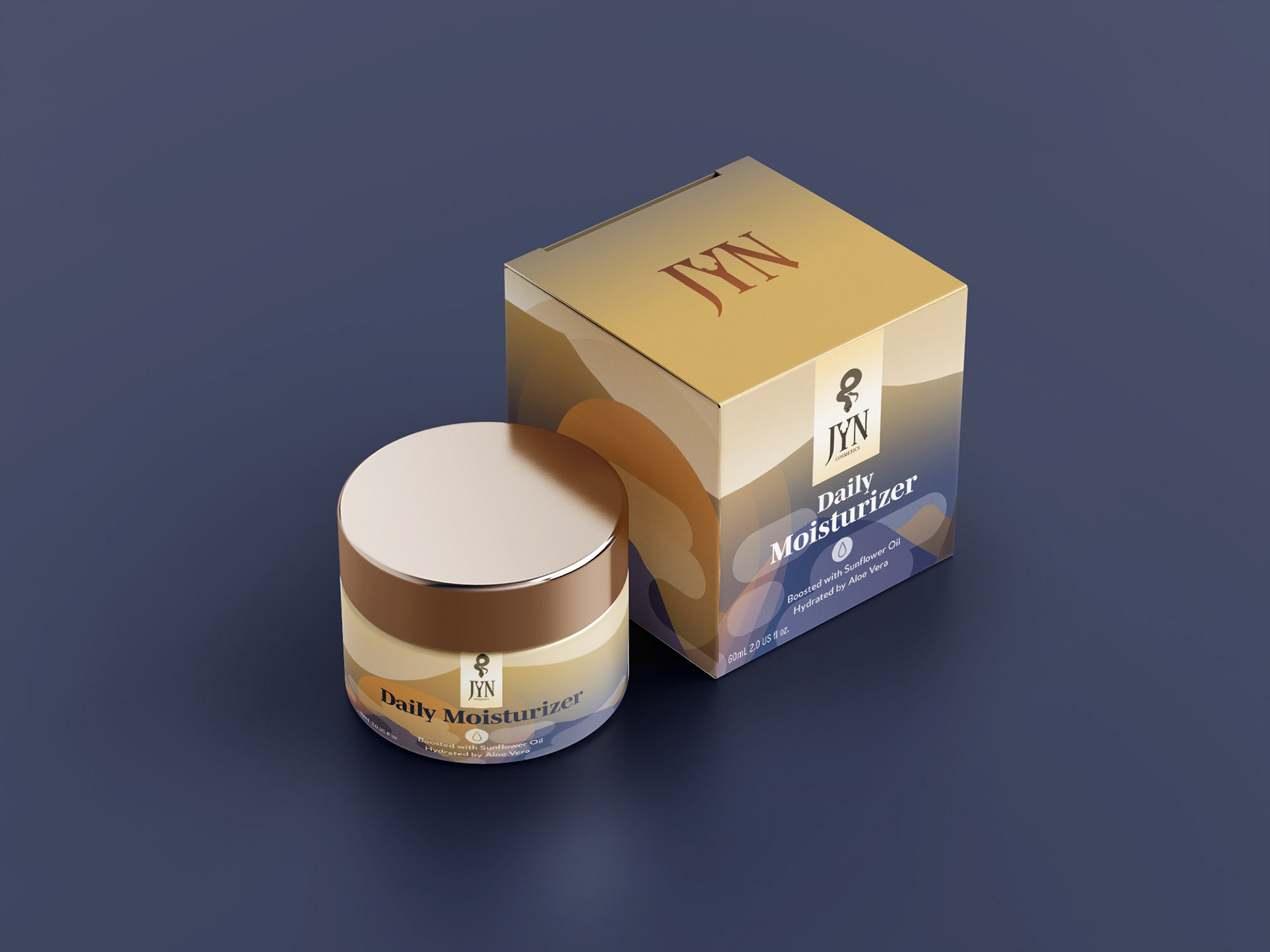
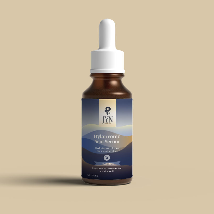
To give off a more masculine-tailored feel to the brand, a mixture of cool and warm tones were used as JYN's primary colors. Minimal, clean nature illustrations are also incorporated in the brand's various skincare packaging to give not only a pleasing visual aspect, but also outline the brand's care for naturally-derived ingredients.
The snake, which is used in different applications of JYN's logo, represents JYN's devotion to healing. A snake, which sheds its skin and begins anew, similar to JYN's message towards the healing of one's cosmetic health. Also being a symbol of change; JYN seeks to change and actively transform the stigma between men and self-care.
