Spirit Cha House is a conceptual tea shop that specializes in high quality, loose-leaf steeped teas. Spirit Cha House offers freshly brewed Japanese teas, steeped in house.
As the primary service is to introduce and serve Japanese teas to an American market, the client wanted to revolve the tea house around a spiritual theme, specifically Japanese Mythology. A big inspiration came from Studio Ghibli's masterful work, "Spirited Away", a film focusing on entering a spiritual world of Japanese Kami from the normal world. Considering this, we wanted Spirit Cha House to encapsulate a similar effect, as if entering the tea house was akin to entering a different world.
In time for their grand launch, Spirit wanted to brand themselves as a trendy, modern tea house. Spirit's goal with their tea house was to break the stigma surrounding traditional tea as a hobby, or refreshment strictly enjoyed by the older generations. They wanted to share the beauty and nutritional benefits of traditional, loose-leaf teas with all generations, but specifically younger generations.
Rather than exposing the youth to coffees, milkshakes, and sodas, Spirit Cha House's goal was to introduce the youth to the beauty of traditional teas.
To execute this goal, we decided to have the tea house revolve around Japanese Kami and Japanese Mythology, and create a vividly unique atmosphere as if entering was stepping into an entirely different world.

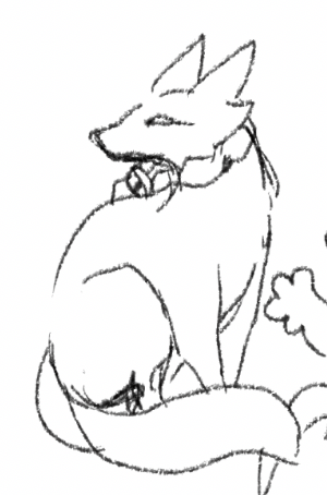
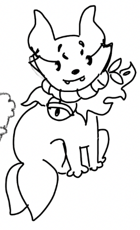

Initial Sketches of Spirit's Kitsune.
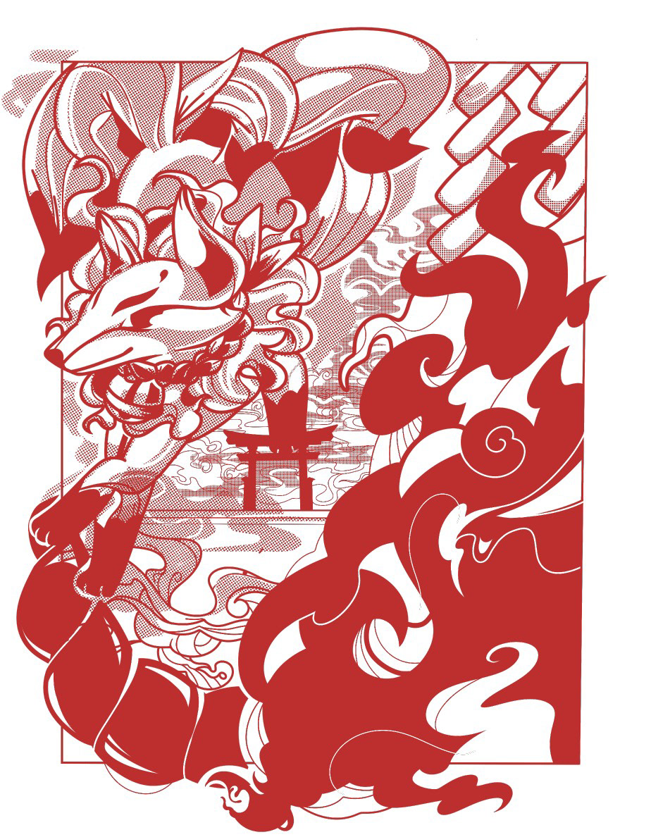
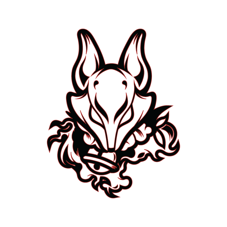
With this goal in mind, we sought to have the brand's symbol to be a Kitsune; a Japanese Kami (according to Japanese Folklore) of a fox, a symbol of prosperity and good harvest.
We wanted to encapsulate the sleekness of the Kitsune and portray it in a way which is recognizable, but also showcases items traditional to Japanese Shintoism (Shimenawa Rope, Suzu Bell), the religion which the Kitsune is strongly associated with.
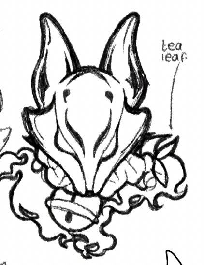
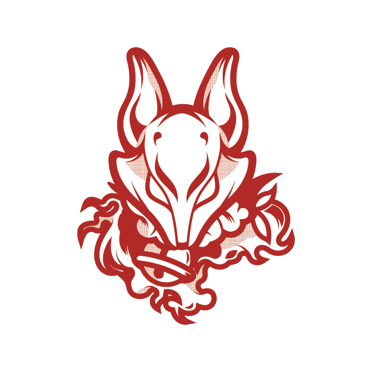
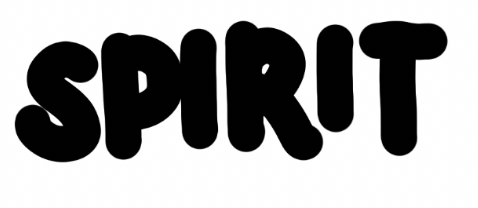

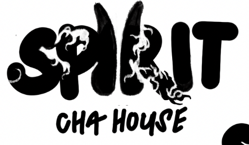
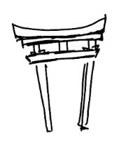
We wanted to capture Spirit's primary logotype as an embodiment of their goal of encapsulating Japanese Mythology and culture.
To really bring this out, we sought to incorporate a Japanese Torii Gate into the logotype, a traditional Japanese gate typically found before a shrine, embodying the transitory stage from the world around us, and into a sacred, spiritual world by the Japanese Shinto religion.
This is a callback to the goal of the tea house. Stepping into the Spirit Tea House is akin to stepping into an entirely new spiritual world.

Spirit Cha House's target audience, considering their primary goal, is of individuals ages 15-25 who enjoy specifically sweets beverages, such as soda pops, slush, sweet coffees, etc, and follow media and media trends, such as vintage or Y2K trends on social platforms, such as Tiktok.
Keeping this particular demographic in mind, we set out to target this audience through producing branding graphics in tune with popular trends seen in young/teen media today.
Considering the revival of Y2K and vintage trends (essentially making a comeback into society and youth media today), we decided to incorporate some of these design trends into Spirit's branding. We incorporated halftone patterns, bold typographic elements, and strong lines to align with these timeless trends, though still aligning with Japanese culture and Shinto items, such as Shimenawa and Shide.
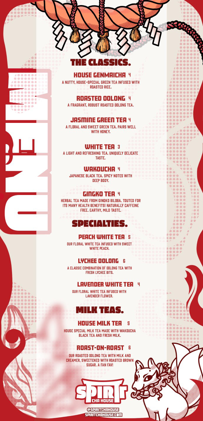
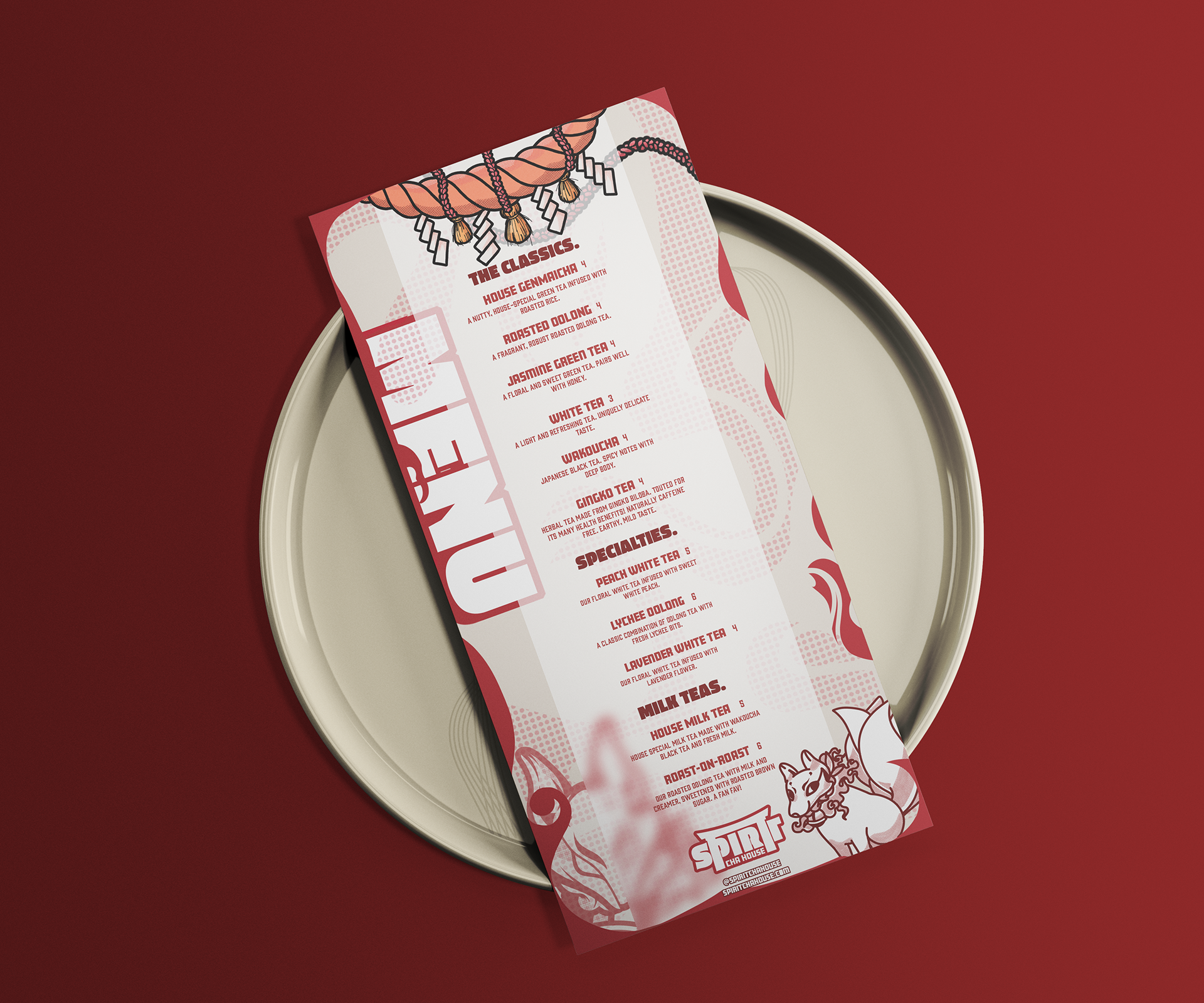
I created promotional banners and cup designs around the premise of being works of art, or something intriguing people could photograph and show their friends.
Commonly among younger generations and along with the rise of social media, young audiences will capture and post their beverages/goods along with business signage as a way to showcase the places they visit. To encourage that, I wanted to design signage and cup designs that these audiences would feel inclined and proud to post.
I incorporated bold designs and Spirit's signature vivid, red color, as well as custom typography and hand-drawn graphical elements both reflective of the brand's Japanese influence and catering to trendy, young audiences to really draw people in as a work of art, and not another ordinary cup or sign they wouldn't want to take a photo of.
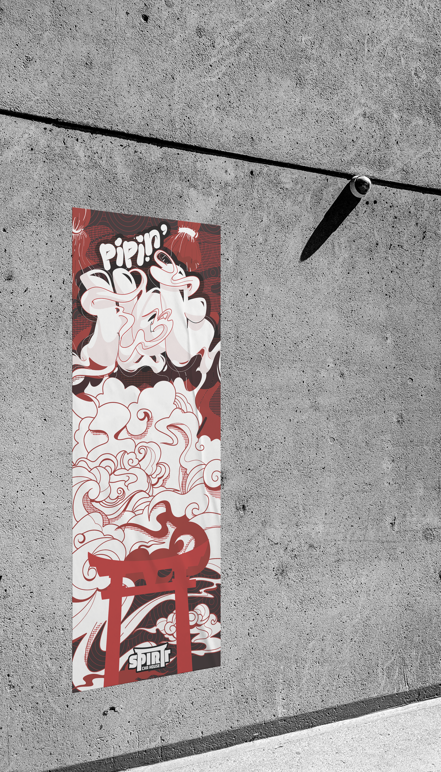
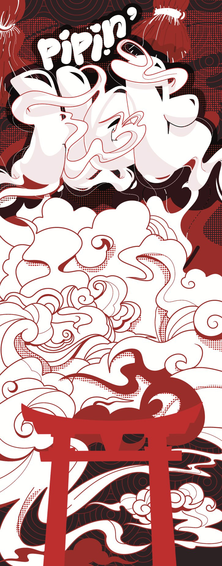
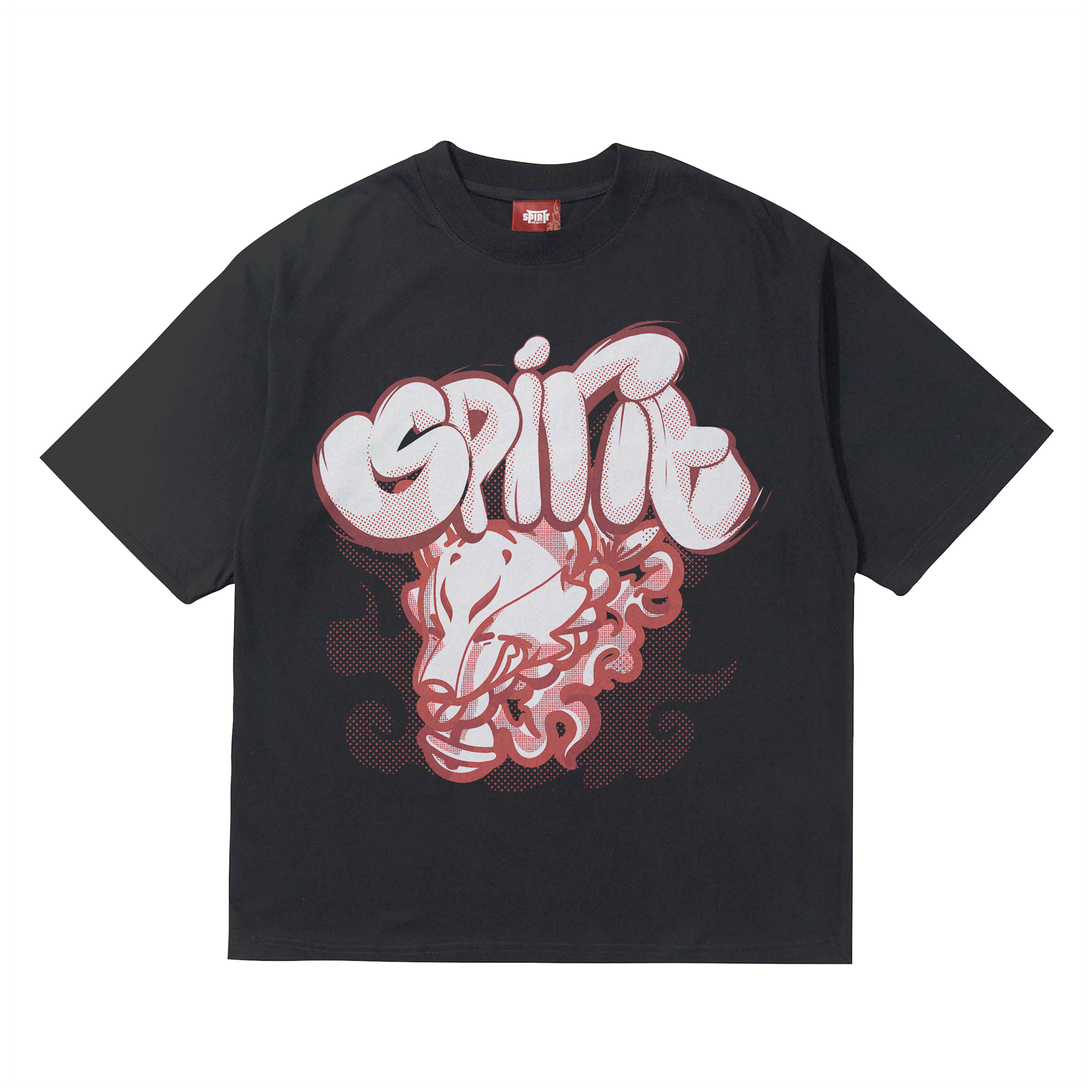
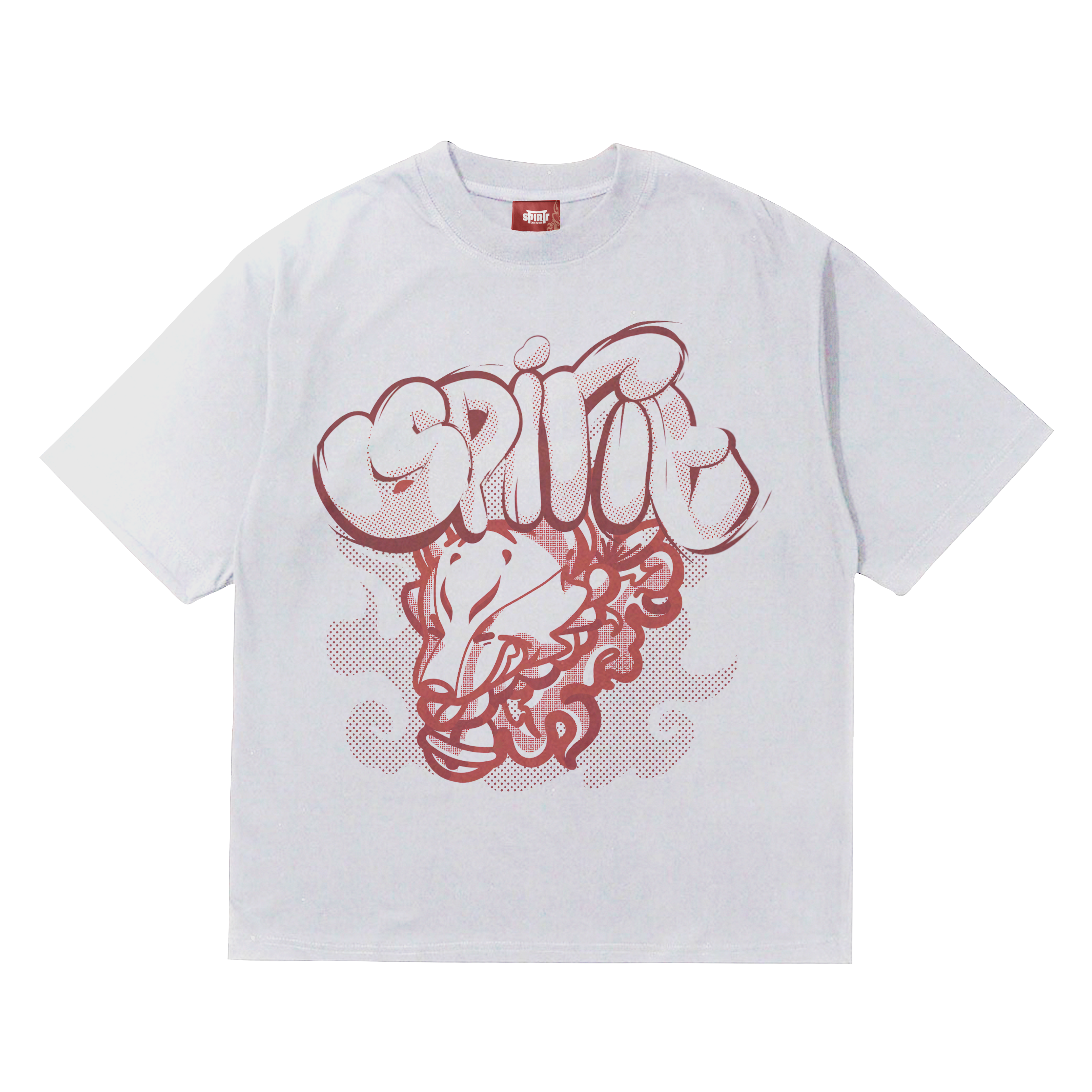
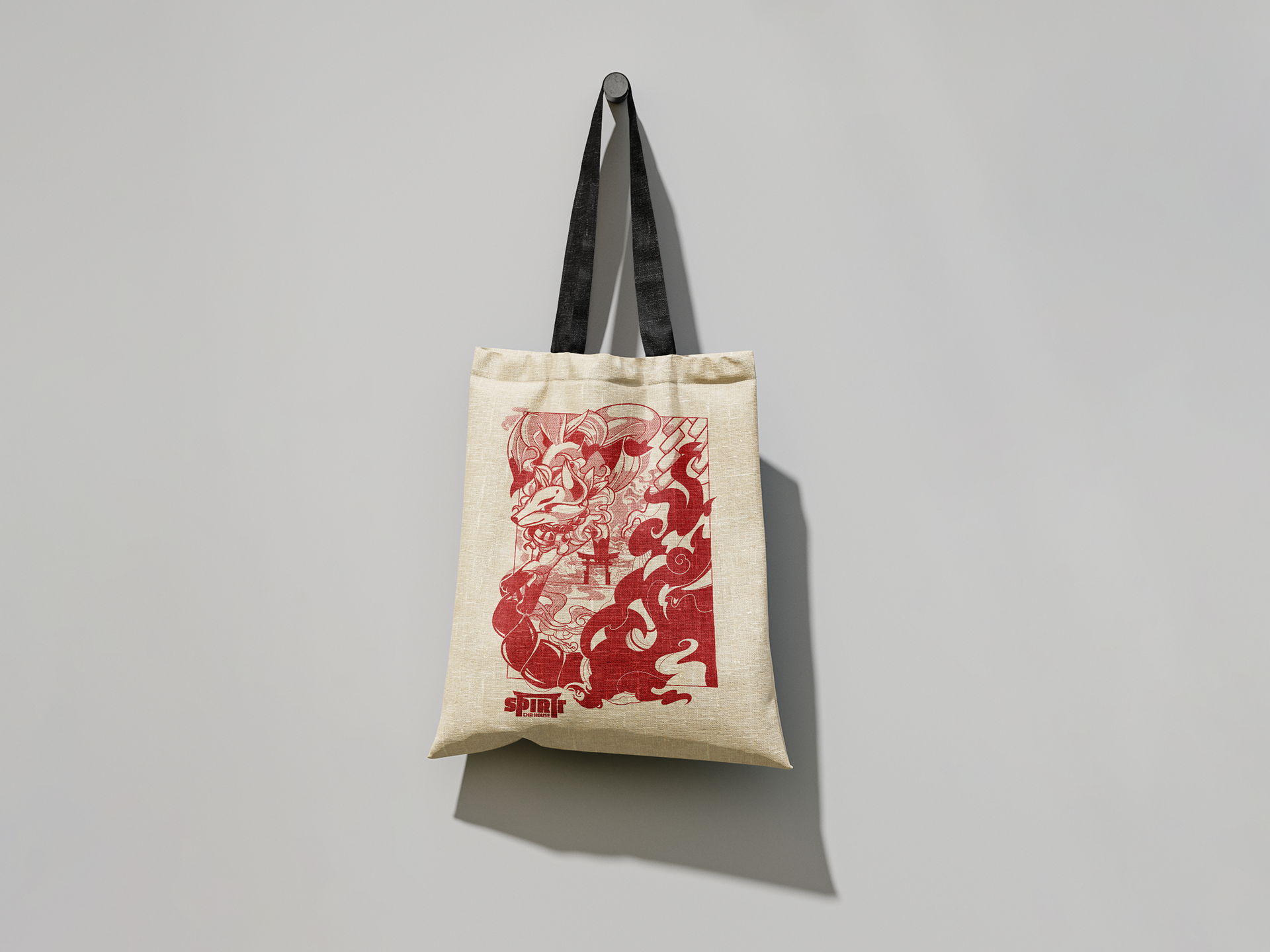
As well as to align with their target audience, we also introduced a line of merchandise outside of teas. Trendy clothing and accessories are something which younger generations embrace, and we sought to create a small line of trendy merchandise they can feel proud to wear.
The issue with creating merchandise as a business is the lack of authenticity within the pieces. Audiences tend to steer from merchandise as they feel as if they're simply promoting the business in an inorganic, unappealing way. Spirit wanted merchandise to showcase them in an organic, and trendy way to appeal to younger audiences.
To alleviate this issue, I wanted to create pieces that were both visually appealing and trendy, but also showcased Spirit as a business in an inconspicuous way. By using strong, custom typography and hand-drawn graphics, I wanted the merchandise to be eye-catching enough to draw attention, but also intriguing enough for people to feel proud of wearing. I also avoided logos being too prominent, as it would ruin the authenticity that Spirit wanted to push.
