Whipped: Urban Cafe & Bakery
Brand Identity, Design, Illustration, Copywriting
Who doesn't like a delicious baked treat? Indulging in a sweet dessert is something ubiquitous and Whipped is no exception. Whipped is a Southern California-based startup serving the community of San Gabriel Valley with delicious, fresh baked goods, delivered right to their door.
This small business was in need of a new, youthful brand identity to appeal to younger demographics, as well as promotional assets in time for their re-launch.
Whipped sought to gear a large part of their advertising towards younger audiences, predominantly those of Generation Z and Millennials, or between the ages of 12-30. As Whipped bakes goods from a home kitchen, we wanted to put emphasis on the personable aspect of the brand along with its customers.
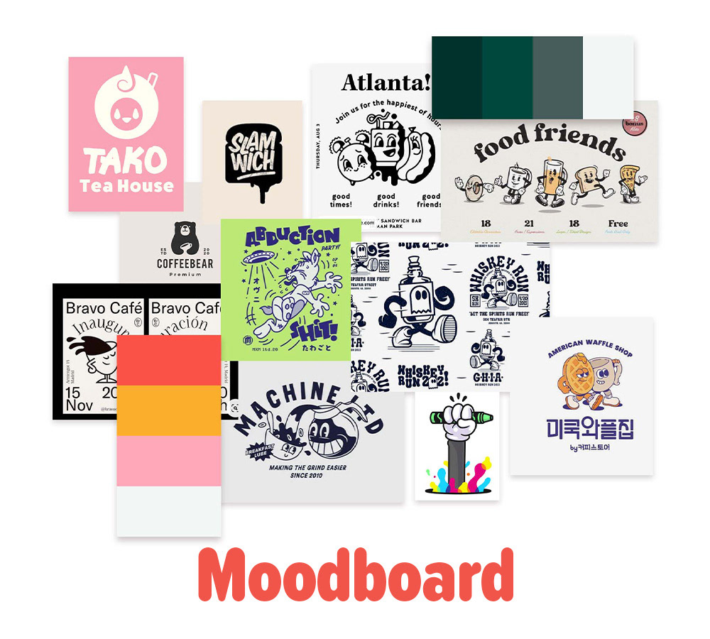
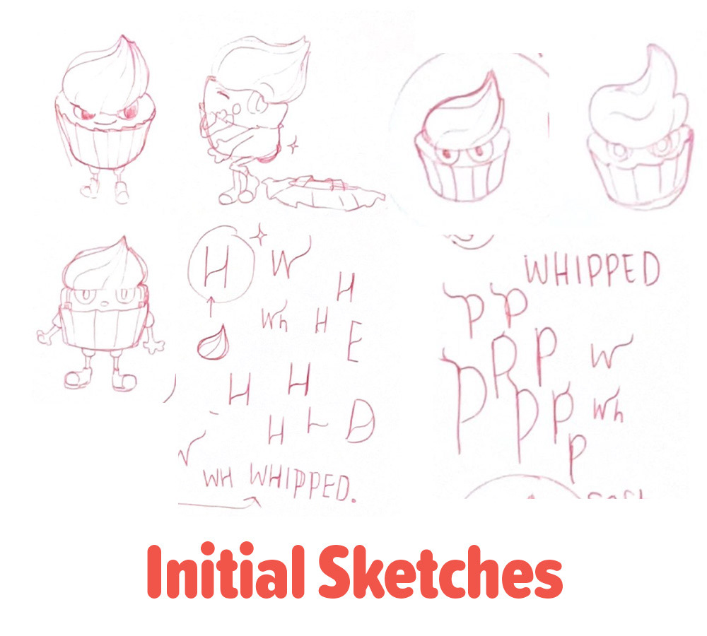
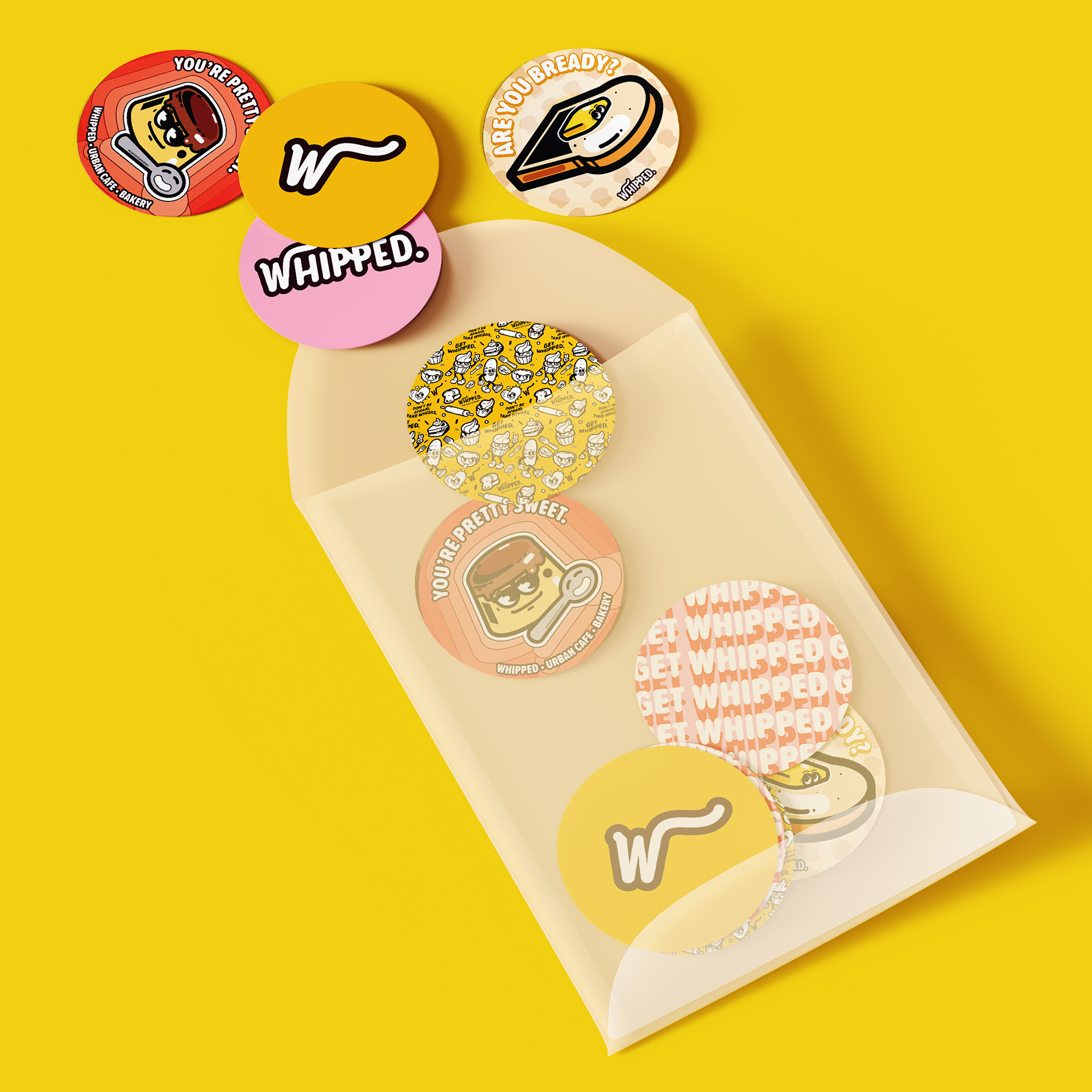
In order to achieve Whipped's goals, I decided to combine vintage styles with clean styles seen today. I went with playful motifs, and I wanted the logo to be reflective of that.
Trendy, Hip, and Young. This was the tone Whipped wanted to set.
We chose to stick with the brand's original warm tones of pinks, but also add on vibrant yellow and orange shades into the palette, which helped bring out the warm, friendly message we wanted Whipped to send to its consumers base.
To set the stage, bold, strong colors were to be utilized for an eye-catching look that appealed to both kids and young adults.
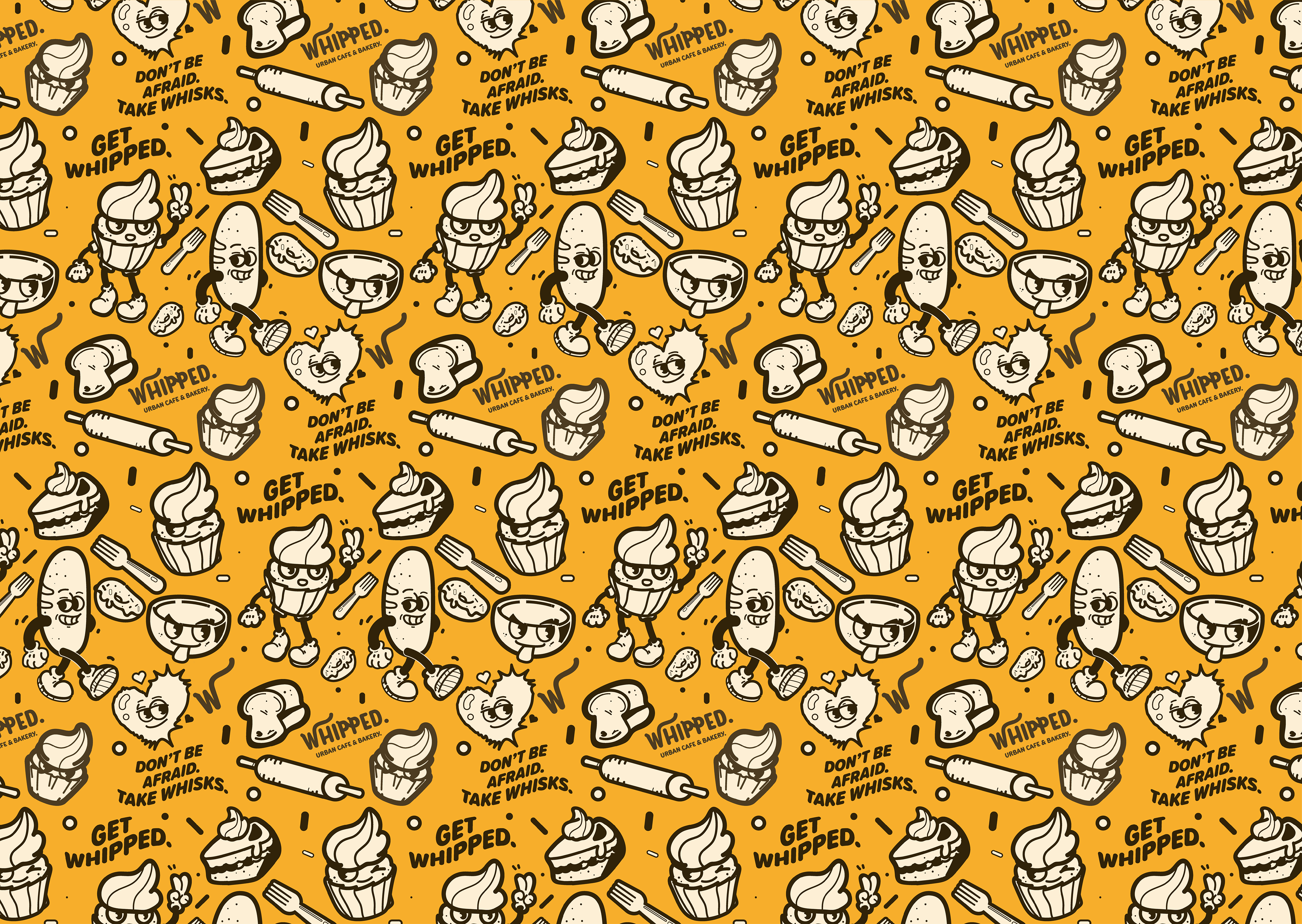
We decided on a mascot for the brand; a cupcake (how fitting!) in that classic, Rubber-Hose style (A call back to the 1900's vintage style that has been revived among newer generations today). The Cupcake mascot, to represent the brand's family-friendly, and personal approach to providing baked goods to the local community.
To cater to younger audiences today, Whipped sought to incorporate classic, vintage elements with more modern design seen today to really push the timeless, but also trendy feel.
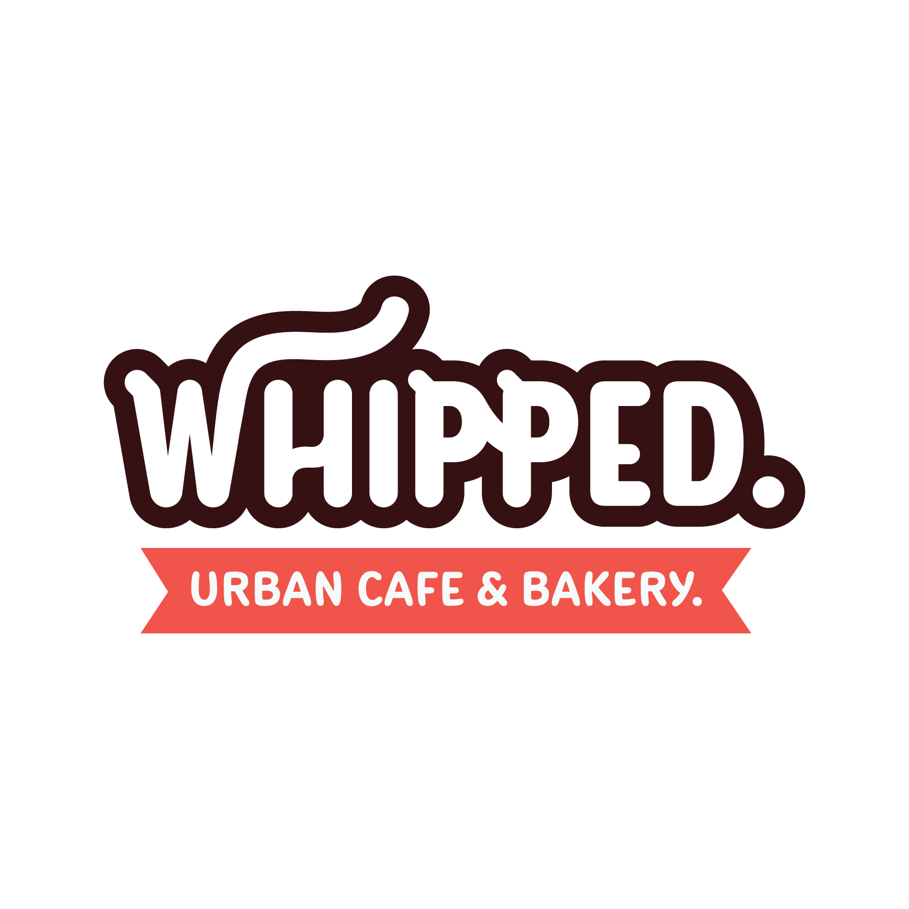
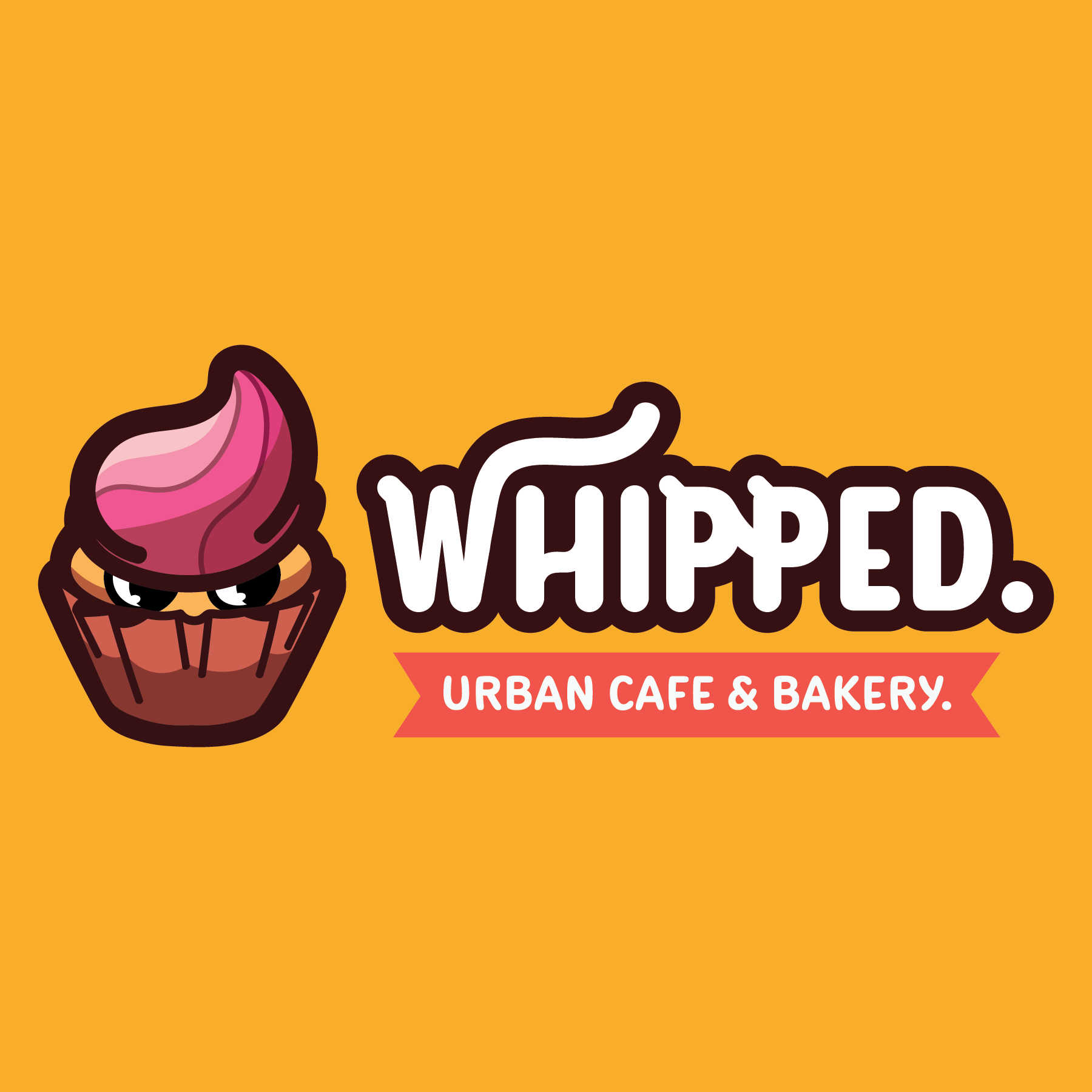

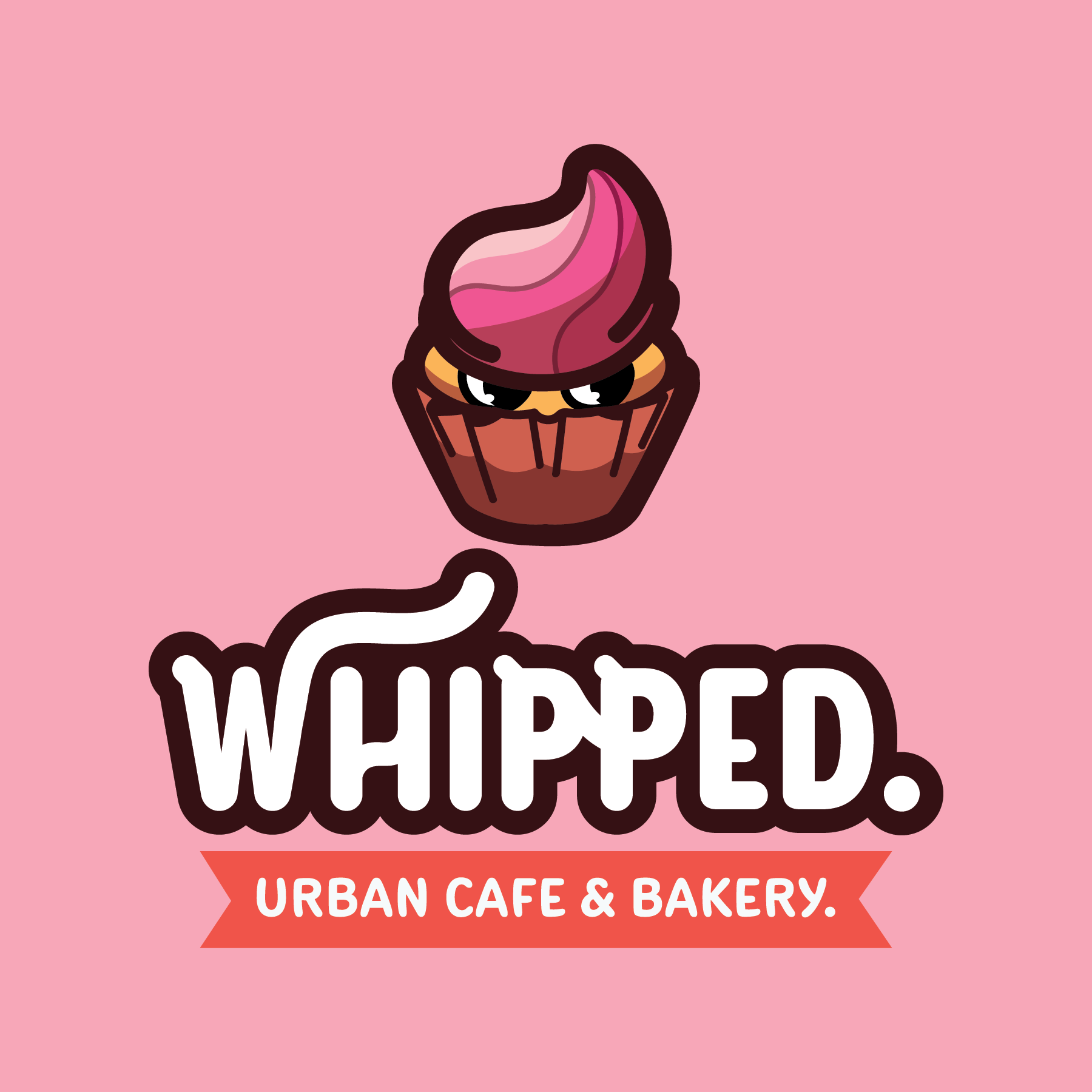
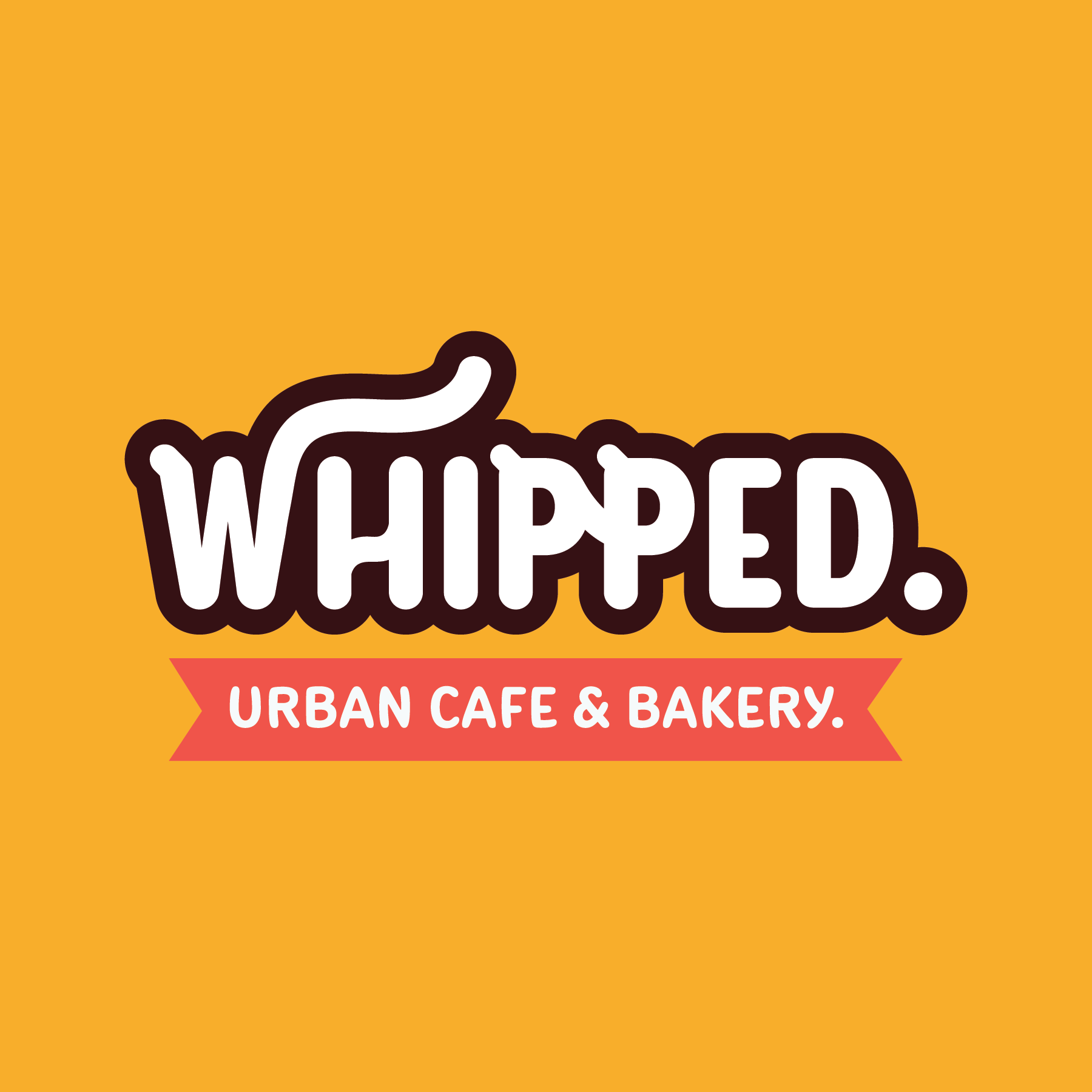
To really pay homage to the "Whipped" name, I incorporated visual elements to the company's word mark, which pushes the fluffy, whipped cream connotation.
When someone thinks of the word "whipped", they'd likely think of whipped cream, or sweet whisked frostings. I wanted the word mark to incorporate visual elements that remind viewers of the act of whipping up sweet cream, but also helps convey that "whipping" motion. These visual elements can be seen in the "W", as well as the two "P's". This can also be visually seen as a call-back in the cupcake's frosting topping.
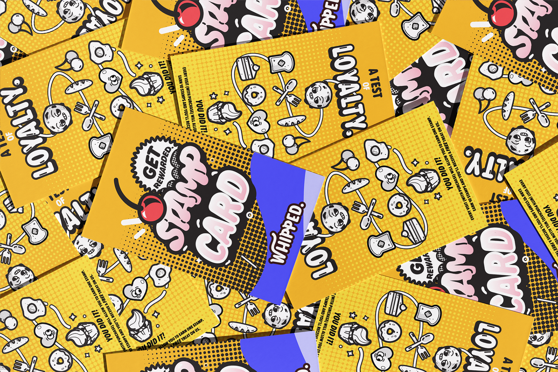
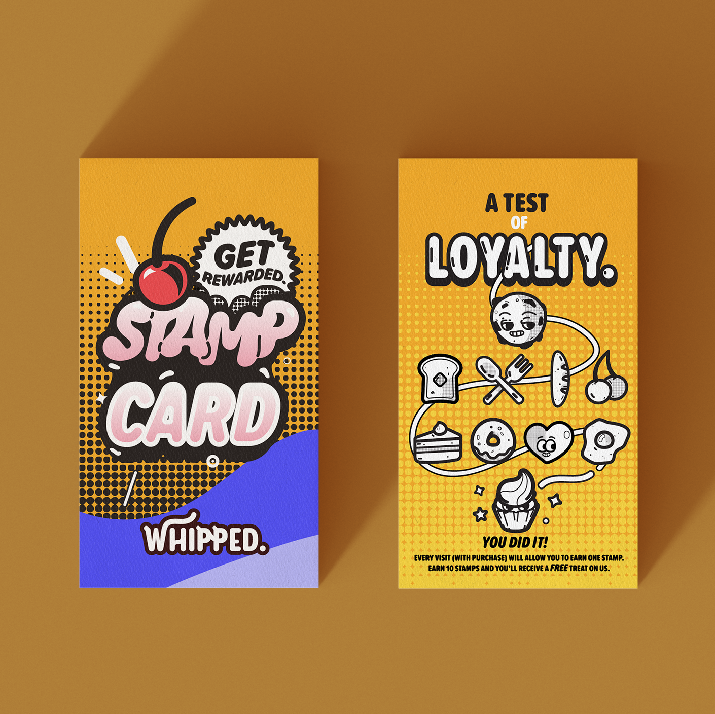
Clean, strong illustrations, as well as bright colors were incorporated with the vintage illustrative approach, bringing a combination of vintage and modern.
Soft, organic typography, with subtle flairs connected Whipped's logo to a more youthful and friendly feel.
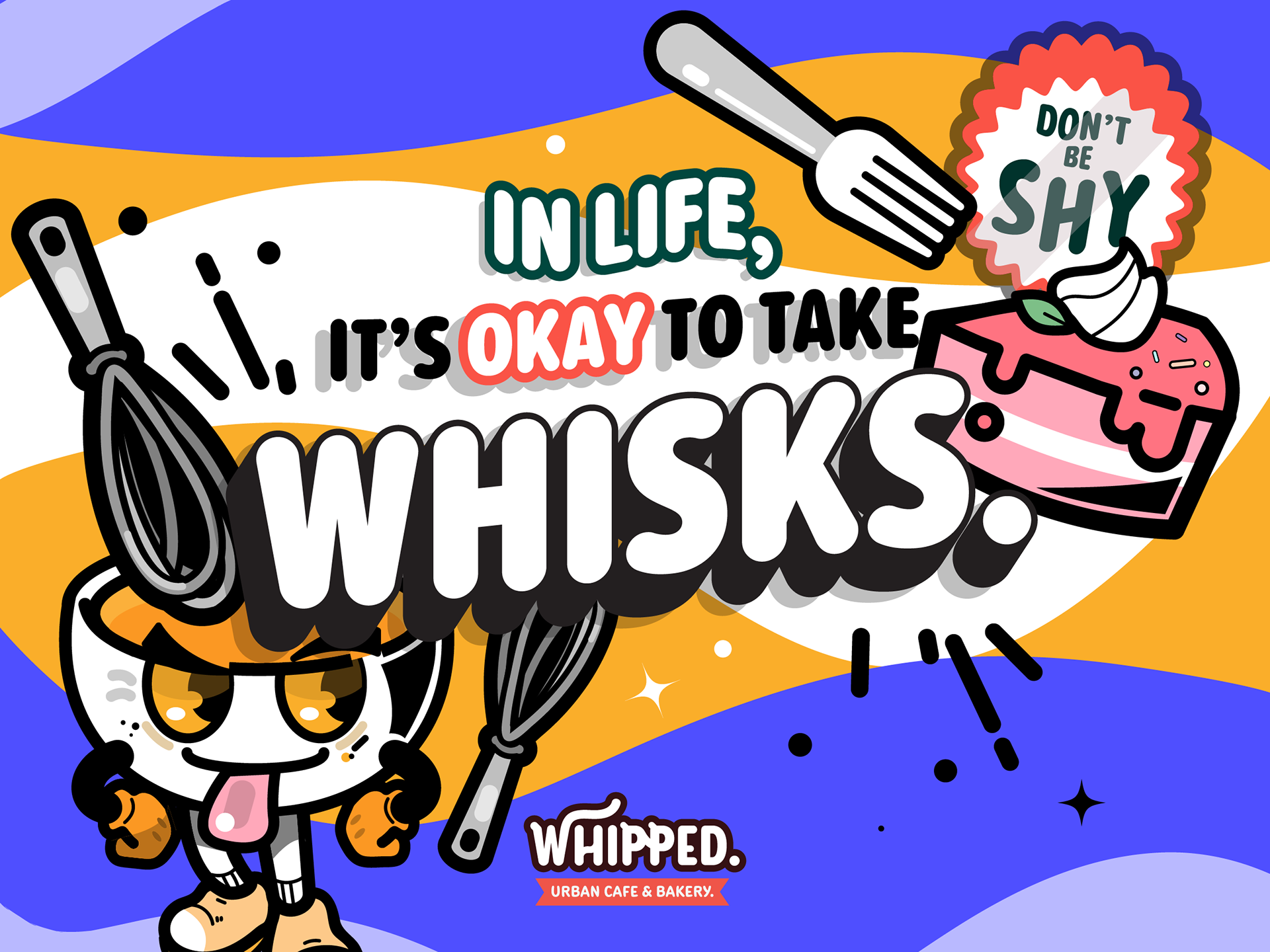
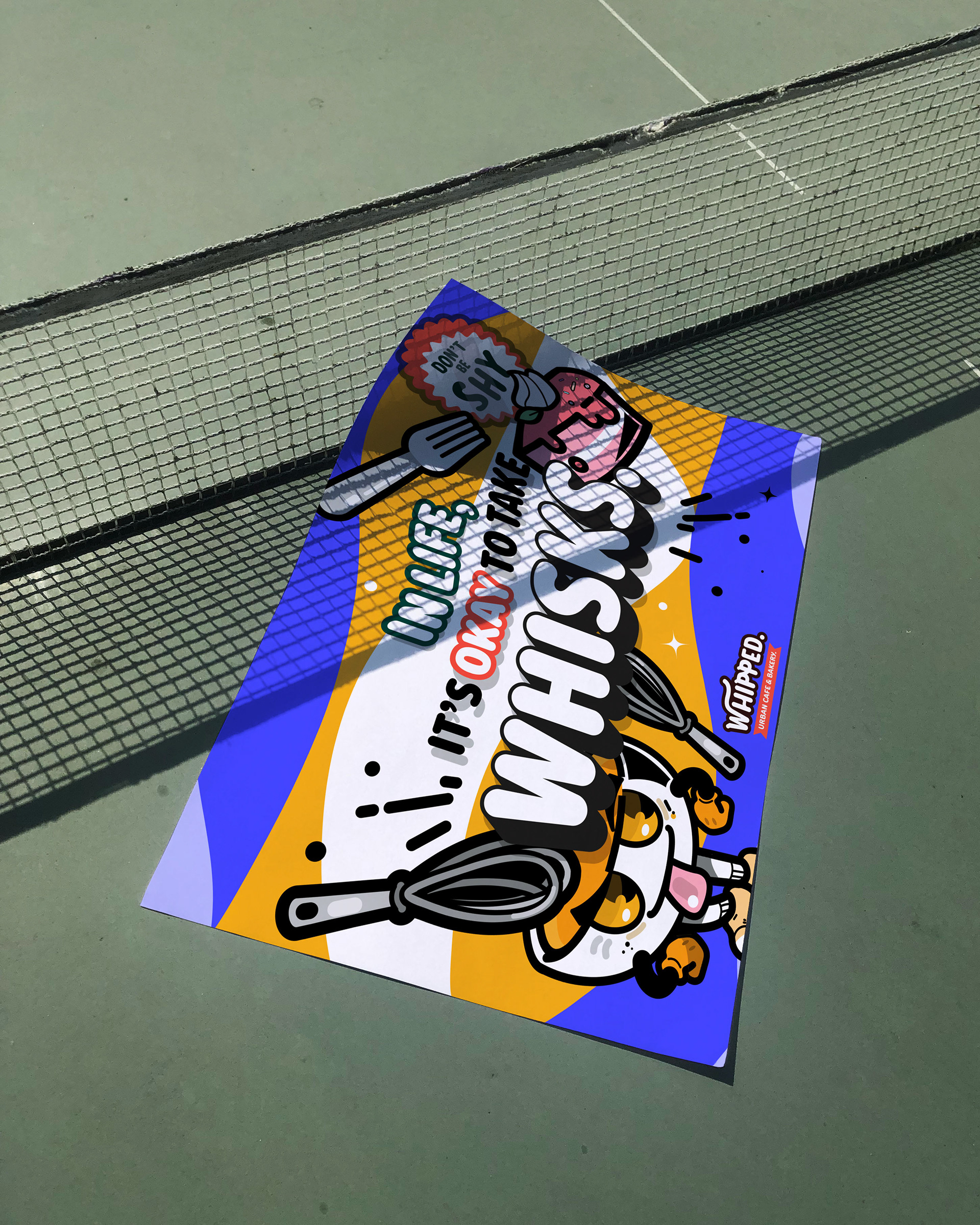
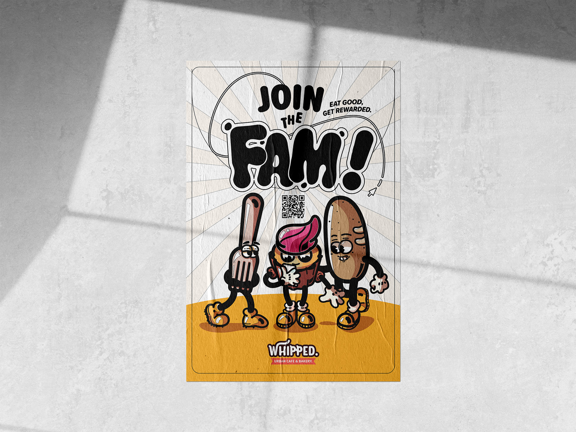
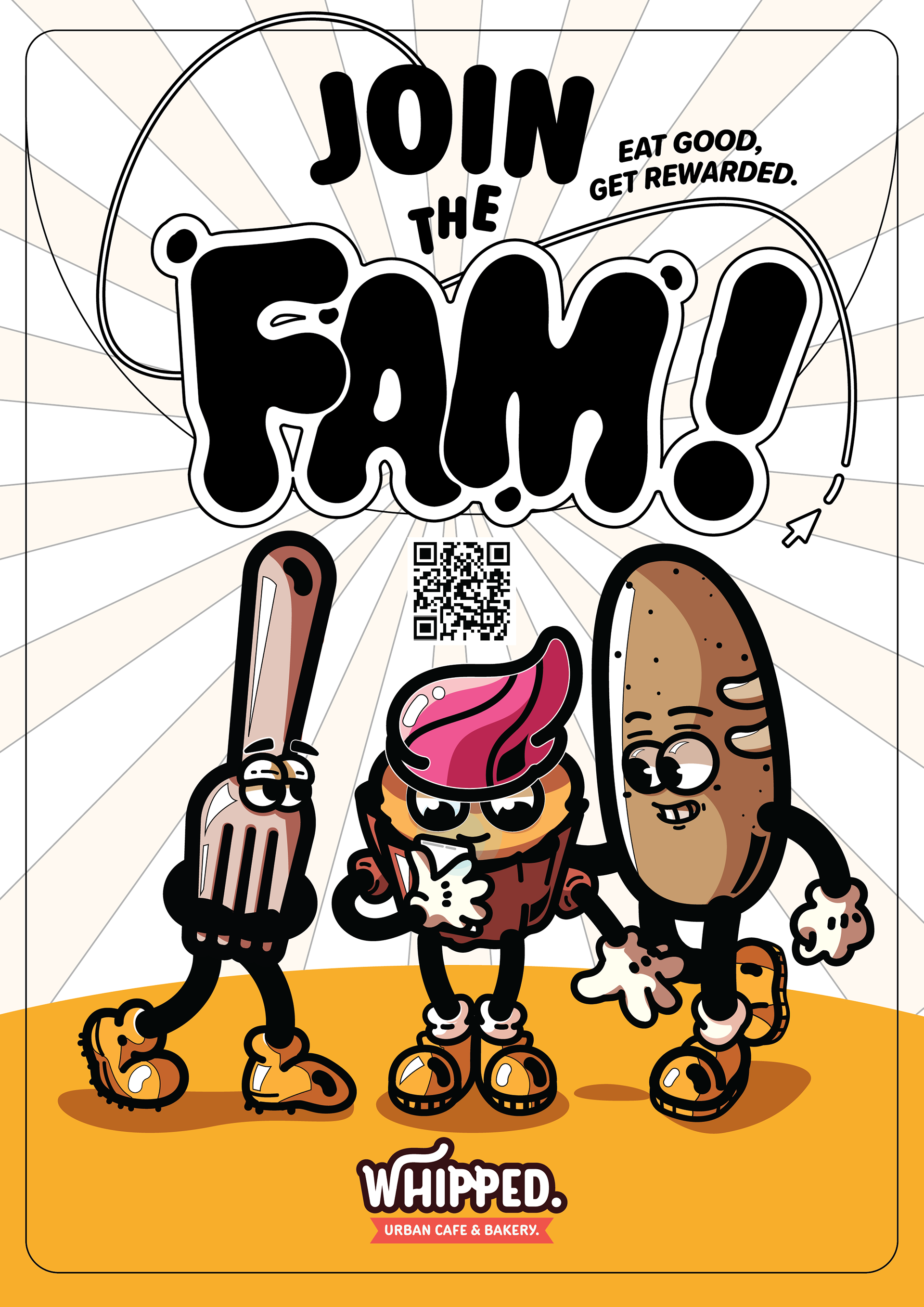
A larger cast of mascots and brand characters were created alongside the original Cupcake mascot. Characters aided in promotional assets visually, and were a great way to appeal to young audiences.
